
PEQUECA
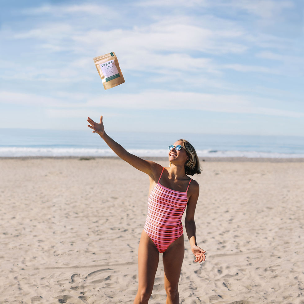
Brand system design for a local premium
granola brand made with high quality ingredients.
Industry: Food & Drink / FMCG
Location: Lima, Peru
Market: Peru
Year: 2020
Context
The brand was born from the initiative to create a food product of the highest quality. Great taste, varied textures, and the best possible ingredients.
Challenge
The challenge focused on creating a brand aligned with its creator's traditional family ties and the idea of sharing that with new generations.
The brand aimed to present itself as a different, fun, high-quality proposition and, especially, without falling into the "healthy product" cliché that granola brands usually sell in the market.
Strategy and New Identity
The brand sought to link the concept of working hard and offering the best possible product with a distinctive image. The logo, color palette, and
brand elements such as illustrations served as tools to generate positive feelings, good vibes and nostalgia.


